Relofriend
A Responsive Website for Russian-Speaking Immigrants Navigating Life in the U.S.

CLIENT
Designlab UX Academy
ROLE
Solo Product Designer, end-to-end
SCOPE
Mobile-first responsive website
CONSTRAINTS
MVP scoped to 2 flows. Desktop explored partially for the 1st flow
TIMELINE
Nov 2025 – Apr 2026
TOOLS / SOFTWARE
Figma, FigJam, Optimal Sort, Lookback, tl;dv, Claude, Figma Make
background
I chose this problem because I'm part of this community. Russian-speaking immigrants arrive in the U.S. and face 3 overlapping problems: scattered unreliable information, complex systems (banking, housing, healthcare, etc.) nobody explains, and real emotional isolation. People were checking 5 to 8 sources before making a single decision, or heavily relying on friends' and relatives' subjective advice. Costly mistakes followed.
The design challenge: build a centralized, trustworthy, personalized guidance platform with verified information people can actually rely on.
research
Methods: 5 in-depth interviews (45 to 60 min, TX, NY, OH), competitive analysis, Telegram and Facebook community review, card sorting (32 cards, 3 participants, Optimal Sort)
Before any research, I wrote 5 questions that guided every interview and every design decision: What are the main challenges? How do people find information? Who do they trust and why? How do language barriers affect decisions? What tools would actually help?
Participants: Russian-speaking immigrants from Russia, Kyrgyzstan and Uzbekistan, 1 to 24 months after arriving in the U.S. All 5 were the primary decision-makers and move organizers in their households: 1 solo mover (young specialist), 3 families with children, 1 family without children. Interviews were retrospective and focused on lived experience, what they wished they had known, and what they would do differently.
competitor analysis
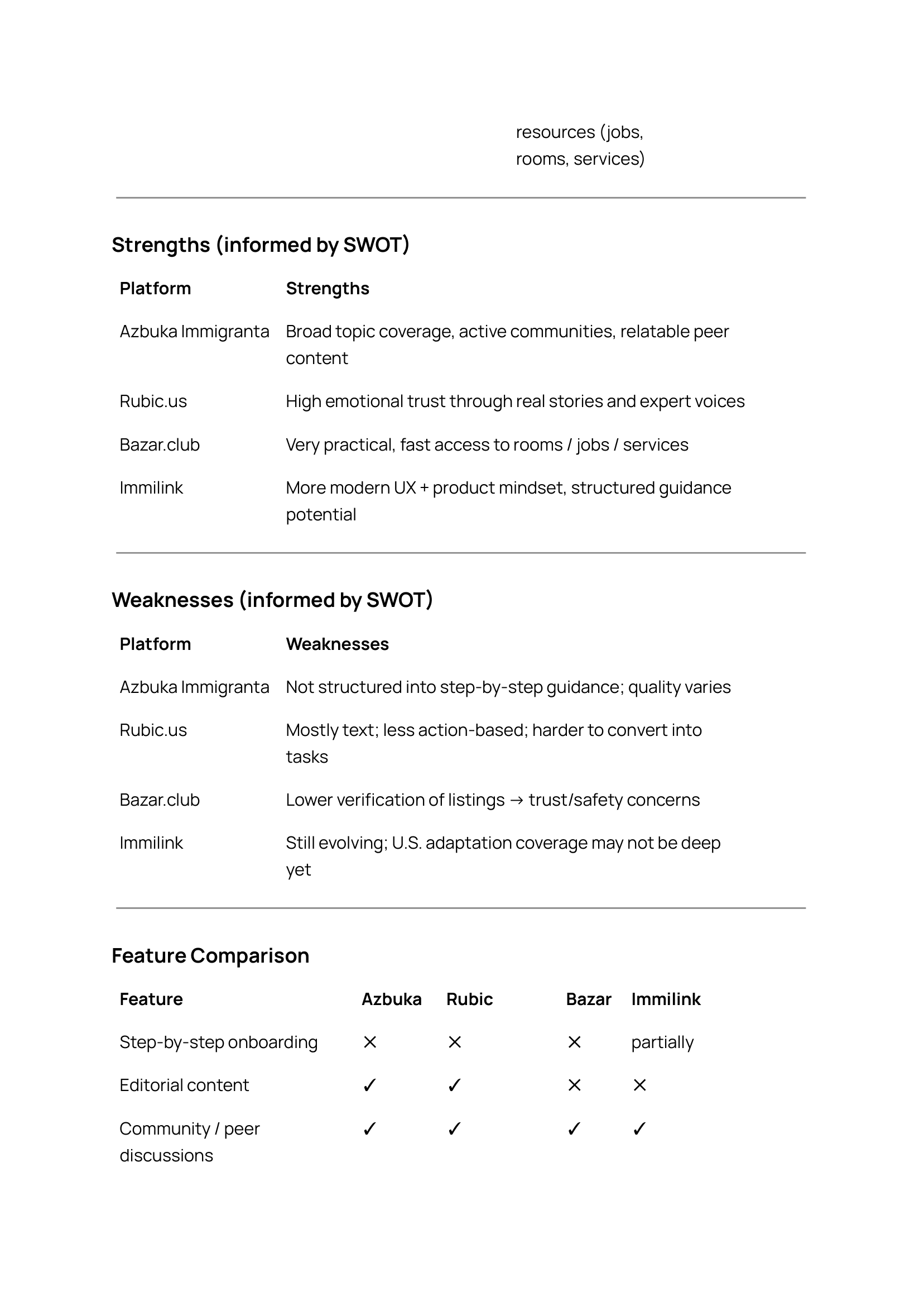
Azbuka Immigranta: strong community, but no structure and hard to navigate. Rubic.us: credible tone, but low actionability. Bazar.club: fast access to jobs and housing, but no trust signals. Immilink: clean modern UX, but limited U.S.-specific coverage.
No platform offered a personalized, step-by-step onboarding experience. That was the opening.

Page 1/3
Page 2/3

Page 3/3
what the interviews revealed
From 100+ observations, 8 themes. 4 came up in every interview:
Information overload. Telegram was the default not because it was good, but because nothing better existed. "Telegram searchable but noisy." People still cross-checked 5 to 8 sources for every decision because no single source felt trustworthy. "ChatGPT helpful but not sole trust, need multiple sources."
No trusted guidance. "We had to do all the research ourselves, and weren't even sure if decisions were right." Friends were the most trusted source, not by preference but by necessity.
Emotional toll. Confidence was a bigger barrier than fluency, fear of doing things wrong. Emotional shock, loneliness and depression hit especially hard for mothers. "Women lonely at home with kids, no time to suffer if working."
Costly mistakes. Bad rentals, delayed documents, wrong banks, bad car deals. Small information gaps had real financial consequences.


User Flow 1: Onboarding & Personal Plan
define: personas
Alina, mid-20s. Overwhelmed First-Timer. Healthcare professional, Green Card winner. Spent 6 months researching U.S. cities alone with no American contacts. Cross-references everything, uses Perplexity for linked facts. Pain points: scattered unverified information, no trusted single source, fear of making costly mistakes. Goal: a verified AI assistant with city-specific answers and real source links. "Want assistant that attaches links. Important to double-check."
Marina, mid-30s. Isolated Family Anchor. Early childhood educator, mother of 5, manages the full family mental load. Runs a support page for immigrant women, helps newcomers find resources. Pain points: outdated advice from relatives, financial hits from bad decisions, deep isolation. Goal: verified relocation guidance and a trusted community. "If there were a circle of reliable people to join, that would change everything."
Both personas share one core need: they need to trust the product before they will use it.

User Persona 1

User Persona 2
POV and HMW
POV statements focused on unclear guidance, limited support, cultural differences, and no reliable help in Russian. 2 HMW questions drove ideation:
How might we give immigrants quick access to current, city-specific, verified guidance in one place?
How might we help them anticipate the emotional reality of the first months, not just the logistics?
feature prioritization: MoSCoW
Must Have: personalized onboarding questionnaire with a generated relocation plan, guides and checklists, AI Chat with verified sourced answers, bookmarking.
Future phases: community layer, family sharing, expert consultations, city-level personalization.
Community was the most requested feature in research. A family task board would also be beneficial. But delivering either half-built would have done more damage than skipping them. A broken community breaks trust.

Feature Matrix: MoSCoW method
card sorting and sitemap
32 cards, 3 participants, Optimal Sort. Key findings: guides, scripts and checklists grouped together naturally; the homepage was seen as a launchpad, not a content category; the AI assistant needed to be reachable from anywhere.
The sitemap is built around thumb-tab navigation, close to a native app experience on the web. Footer links "Create My Plan" from every page.

Sitemap (main navigation and footer)
user flows
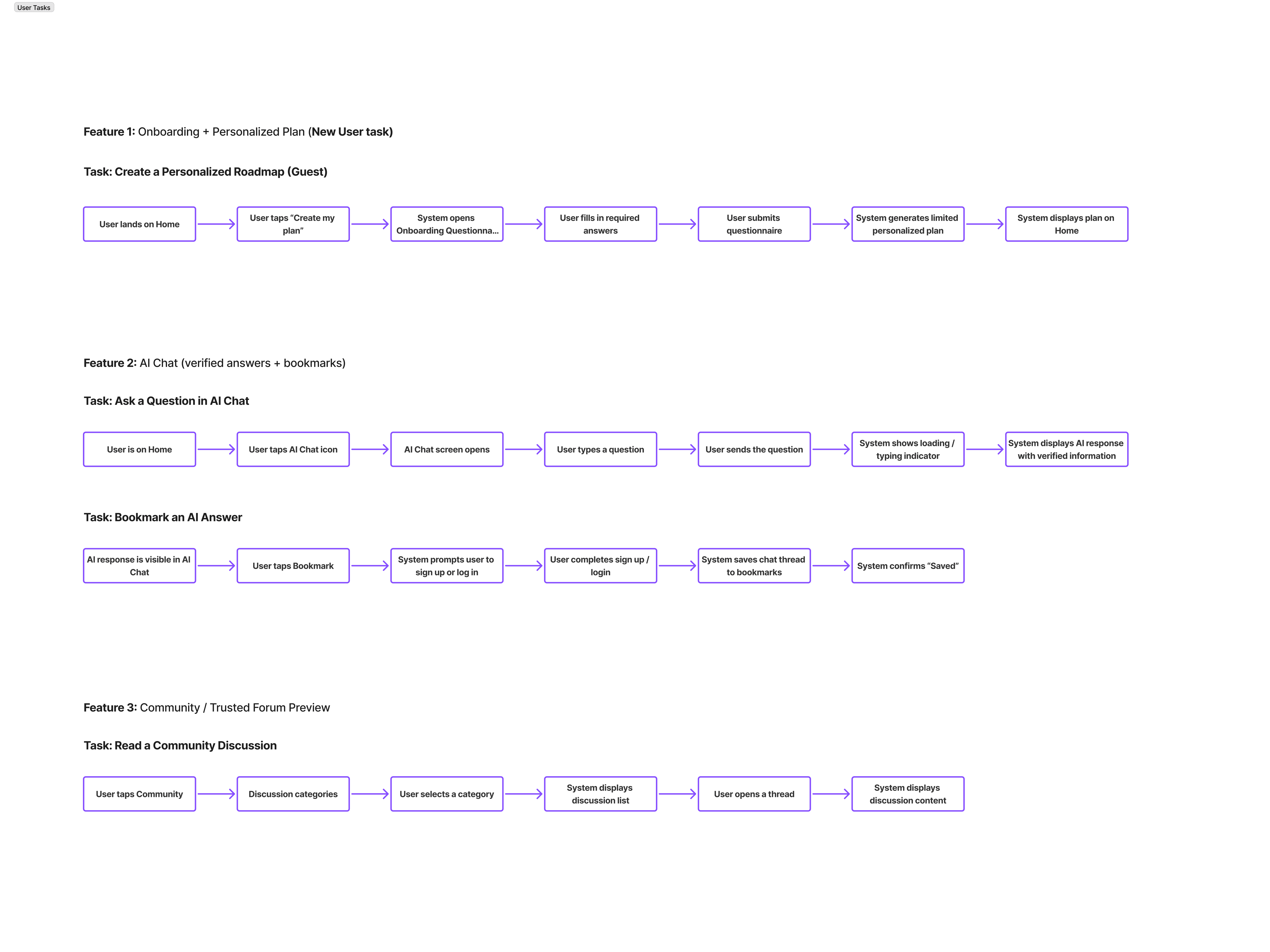
Flow 1: Onboarding + Create My Plan. User taps "Create My Plan," answers a questionnaire covering family, housing, language, job and transport, then receives a personalized step-by-step relocation roadmap.
Flow 2: AI Chat + Bookmarking. User asks a relocation question, receives a verified sourced answer with dated links, bookmarks it for later.
The community flow (Flow 3) was scoped out for the future phase.

3 user flows: 1. Onboarding + Personalized Plan; 2. AI Chat & Bookmarking; 3. Community
3 task flows
design: wireframes
I started with mid-fidelity using Figma Make and Claude, testing real content earlier than a traditional process allows. Lo-fi sketches followed as a structural reflection tool, not a generation tool.
Mobile: full coverage across both flows. Desktop: key screens from Flow 1 only.

User Flow 1: Onboarding & Personal Plan

User Flow 1: Desktop key screens

User Flow 2: AI Chat & Bookmarking
branding
Cera Pro for dual Cyrillic and Latin script support. Russian-language compatibility was a core requirement, not an add-on. Blue and green palette for trust and calm without the coldness of official systems. The logo reflects the friendliness embedded in the name itself. Built to work at every size, from the tab bar favicon to the full header.

Branding (logo, icons, colors, typography)
hi-fi design
English version first for content verification. Russian version followed using Figma AI with manual revision, then tested with the actual target audience.
Key screen decisions:
Homepage: "Create My Plan" CTA at top, search below, footer quick links for return users
Questionnaire: radio buttons for single-select, chips for multi-select, step intro weighted more than question titles
Roadmap: premium content gated at the end, after real value is already delivered
AI Chat: sources with publication dates at the top of every answer, bookmark and share on every response

Hi-Fi Design featuring 2 main user flows (Onboarding & Creating personalized map, AI chat & Bookmarking)
UI kit
I developed a full component library covering both flows and both languages.

UI kit: components
usability testing
5 participants (3 returning, 2 new), moderated remote on mobile, 40 to 50 min sessions, Lookback and tl;dv.
I tested both flows against defined hypotheses and measured task completion, time on task, user satisfaction, and AI trust. Flow 1 hit all targets. Flow 2 hit most, but AI answer trust scored 3.6 out of 5 against a target of 4.0.
Note: some Flow 2 friction was a Figma prototype limitation, not a design flaw. Participants wanted to type on a real keyboard and select their city from a dynamic dropdown, neither of which Figma can simulate.

Hypotheses and scenarios

Metrics

Impact/Effort Matrix: prioritizing tasks
what testing showed
Homepage search bar caused cognitive overload. Users froze on landing. The search bar gave no clear starting point, especially for people who didn't know yet what they needed to search for.
Questionnaire controls were ambiguous. Single vs. multi-select was unclear. Users made selection errors and lost confidence in the interface.
Verification badges backfired. Users ignored them or assumed they were decorative. The badges felt like a confident design bet. The data killed them.
Paywall before value was rejected. 3 out of 5 reacted negatively to a Pro prompt before receiving anything from the product.
Sources buried in AI Chat drove trust below target. Users wanted to verify recency before acting on advice. Burying sources was not neutral, it reduced trust and kept the AI trust score at 3.6 against a 4.0 target.
Key insight: personalization is the biggest lever for trust, not visual polish. City-level bank recommendations with dated source links would push the score from 3.6 to 4.0.
revisions
All P0 changes applied based on the Impact/Effort matrix:
Homepage: CTA moved to top, search below, CTA added to footer. Questionnaire: radio buttons, chips, helper text, step intro weighted more heavily, mistranslations corrected, full interface translated to Russian. Content cards: bookmark and share added, titles span full width. AI Chat: sources with dates moved to top, FAQ font reduced, bookmark fills on save, badges replaced with a tooltip. Monetization: Pro prompt moved to end of roadmap. Visual: whitespace added, cards set to consistent height.

CTA repositioned higher to lessen cognitive overload;
Links were visually emphasized with an underline to indicate that they are clickable.
Badges have been removed and will now be clarified in the tooltip accessed by the ? icon.
The bookmark and share options are easily accessible on the card for quick access. The title spans the full width of the card and is truncated after 2 lines.
White space is incorporated throughout the layout to enhance breathability.
A link to create my plan is designed for new users who want to easily access and locate it on the page.
The interface has been translated into Russian to address the many experiences people have had with language comprehension issues.
Step intro needed stronger visual prominence
Single vs. multi-select affordances. Unclear controls cause hesitation and selection errors.
Questions and mistranslations have been corrected throughout the questionnaire.

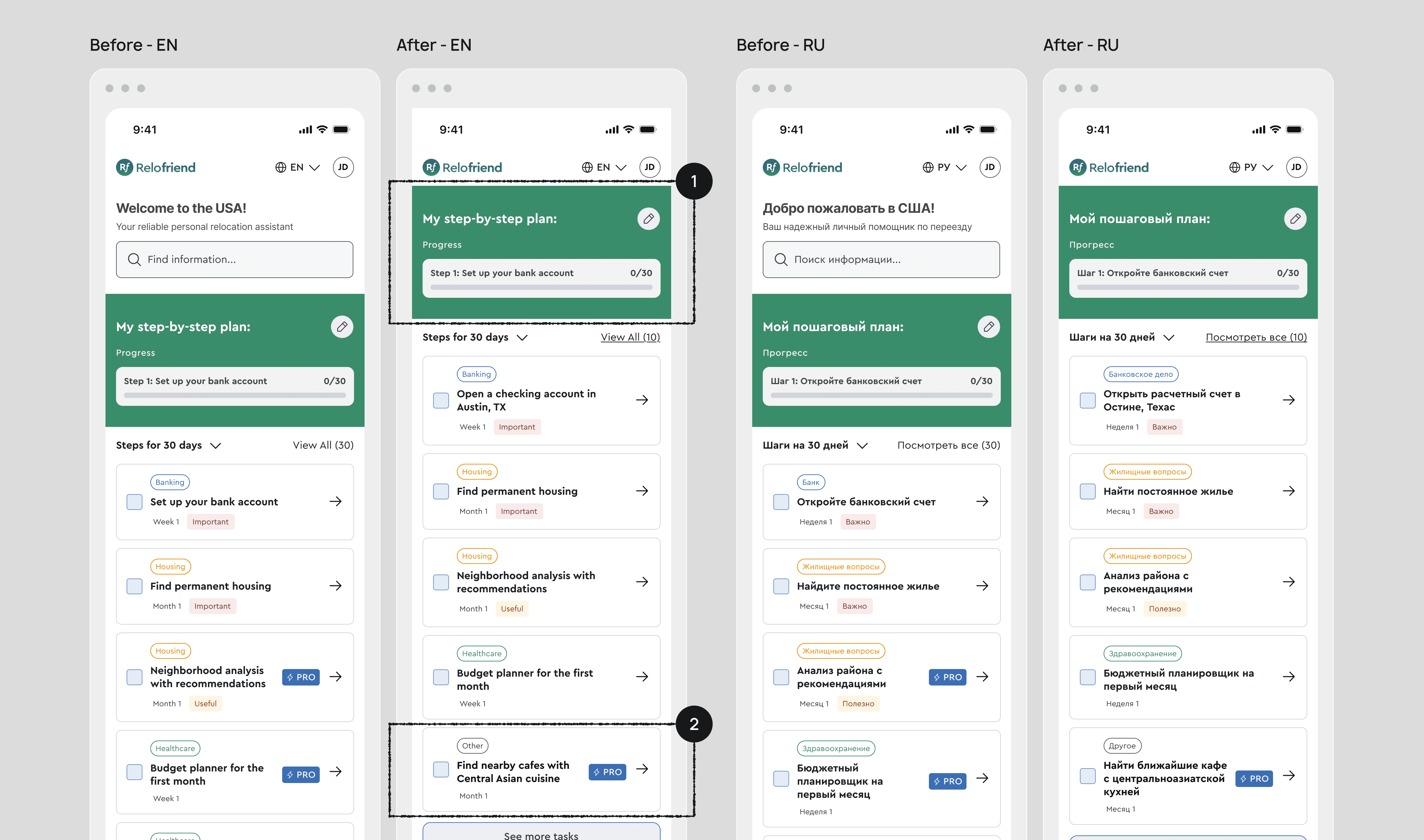
Homepage Structure and Placement of "Create My Plan". Upon visiting the page featuring the search bar, one user reported feeling overwhelmed by cognitive overload.
Monetization timing and placement moved further down. 3/5 reacted negatively to seeing a Pro prompt before receiving any value.
Badges have been eliminated to reduce clutter as suggested by users, and have been replaced with links positioned at the top of the answer.
FAQ font size in AI Chat. Finding: A user suggested reducing the FAQ font size so more questions fit on screen at once without requiring horizontal scrolling or taking up too much space.


The bookmark fills with color after saving, in accordance with the heuristic principle of system status visibility.
Bookmark and share are at the top of the answer to quickly share and save the info as desired by a user persona. Sources are immediately accessible for crossreferencing with sources and date of publication.
The question exemplifies the type of answer we aim for: it should be profound, personalized, and insightful, specifically tailored to engage a Russian-speaking audience. It should also be distinctive and provoke thoughtful discussion. Additionally, it should include follow-up questions that adhere to the principle of heuristic recognition rather than recall.
final results
What I'm proud of: shipping a tested, bilingual product end-to-end as a solo designer.
What was challenging: every decision came back to 1 question: would a newly arrived immigrant actually rely on this? That was the hardest design problem in the project.
What I learned: hypotheses get disproven. Testing humbles you. The verification badges seemed like a solid trust-building element. Users either ignored them or found them confusing. Personalization beats visual polish. Content needs to be written for a Russian-speaking mindset, not translated from American advice. For a subscription model to work, the information needs to be genuinely useful, specific and hard to get elsewhere — the kind of thing AI chatbots can't reliably provide on their own.
What I'd do differently:
Deferred sign-in, where the roadmap auto-saves before asking for an account. This is something I'd bring to the technical team early to discuss feasibility and scope.
I'd run a willingness-to-pay study before finalizing the monetization model. Users rejected the paywall before receiving value. The stronger question is what they'd pay for without hesitation. City-level verified guidance is one hypothesis. Participants mentioned finding local Russian-speaking specialists, building credit history, and navigating housing with local expert support. These are hard to get through AI alone and exactly the kind of content worth testing a subscription around.
Next steps: Round 2 testing to validate P0 iterations. City-level personalization with a dev team. Deferred sign-in. Community layer and access to vetted Russian-speaking specialists (doctors, lawyers, bank officers). No competitor offers both in one place.
prototype
Just in case the embedded frame below does not work:
Prototype - [link here];

“There wasn’t anyone we could just ask and get all the answers from — no one whose opinion we could really rely on. So we had to do all the research ourselves: search for information, study everything, and that was difficult. On top of that, we weren’t even sure if the decisions we were making were the right ones.”

Alina